Samsung One UI Review: Features and Comparison with Samsung Experience
There’s no denying that Samsung’s new One UI skin has dramatically changed how we felt about Samsung smartphones on a whole. In this Samsung One UI Review, we will be listing and […]
There’s no denying that Samsung’s new One UI skin has dramatically changed how we felt about Samsung smartphones on a whole. In this Samsung One UI Review, we will be listing and elaborating all the Samsung One UI features and changes. Furthermore, we will also be comparing it with Samsung Experience in the form of screenshots. It should help you reckon the complete transition of moving from Android Oreo-based Samsung Experience to Android Pie-based One UI.
Advertisement
Samsung is definitely praised when it comes to their phones’ build quality, design, and hardware. However, the software has been a part that most of the users would complain about. It was often sluggish, packed with gimmicks, and somewhat destroyed the whole user experience.
Back when the company released Samsung Experience with Android Nougat for the Galaxy S7, it took a huge step forward in terms of the OS. But it wasn’t as convincing since the software was still mitigating the performance with the same resource-hogging features that TouchWiz had. So, it was mostly just a new coat of paint over the same old interior.
This has finally changed with Samsung One UI, the company’s new shiny and highly-improved software suite or custom OS or stock skin, whatever you may like to call it. Samsung has strived on building something that is more user-centric and it seems to have done a nice job with the first version of One UI.
Advertisement
I bought my first Samsung Galaxy smartphone, the Galaxy Note 8 a month ago (And broke the screen in 24 hours, haha!). Even though the phone already received Android Pie-based One UI update, I deliberately used Samsung Experience to find out the differences in real-time, both visually and performance-wise. And now, after using both I can confidently vouch for Samsung One UI, it sure is fast, looks way better, and the improves the overall user experience significantly.
Page Contents
- Install Samsung One UI on your Galaxy Device
- Samsung One UI Features
- 1. Based on Android Pie
- 2. Better Colors and Rounded Blocks for Focus on Task at Hand
- 3. Highly Improved One-Handed Usage
- 4. System-wide Night (Dark) Mode
- 5. Home screen, Lock screen, and Icons
- 6. Notifications, Quick Settings Panel, and Settings
- 7. Multi-tasking Window and New Full Screen Navigation Gestures
- 8. Always-On Display
- 9. Improved Keyboard
- Samsung One UI vs Samsung Experience
- Opinions
Install Samsung One UI on your Galaxy Device
Samsung began beta testing its new Android Pie-based One UI software back in 2018 for the Galaxy S9 and S9+. It was in late December when the stable update was finally rolled out to the users. The rest of the flagship lineup including Galaxy Note 9, Galaxy S8/S8+, and Note 8 also got the update in the following months.
And more recently, the OEM started pushing Android Pie One UI update to its mid-range Galaxy A and J series devices. It sure seems like Samsung is really on its toes finally, when it comes to software updates.
If you have not yet been able to update your Galaxy smartphone to One UI, then you can download the Pie firmware for your device using SamFirm Tool. Once downloaded, you can follow the instructions in the tutorial linked below for your specific device.
Samsung has already planned to release Android Pie for several of its smartphones and tablets in 2019. So, if your device has yet to get the slice of Pie, the list of Samsung One UI features below will give you good idea of what to expect from the update.
Samsung One UI Features
1. Based on Android Pie
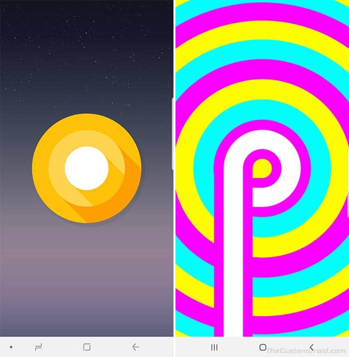
The first most significant and obvious change is that One UI is based on Android Pie. Which means, it also packs all the new features offered by the latest Android version. Android Pie, in itself, is a huge upgrade over its predecessor (Android Oreo) and it takes a lot in from the modern-day machine learning technology.
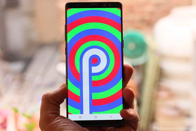
From features like Adaptive Brightness, Adaptive Battery, to App Actions, the software is always learning to provide a more personalized experience to each user. Another hefty feature that accompanies, is the new gesture-based navigation system, that Samsung has neatly adapted to in One UI. For the complete list of new features introduced by Android Pie, you can also visit the official website.
2. Better Colors and Rounded Blocks for Focus on Task at Hand
Before we get to the visual changes concerning specific sections of the UI, let us talk a bit about the more general/unified changes across the interface.
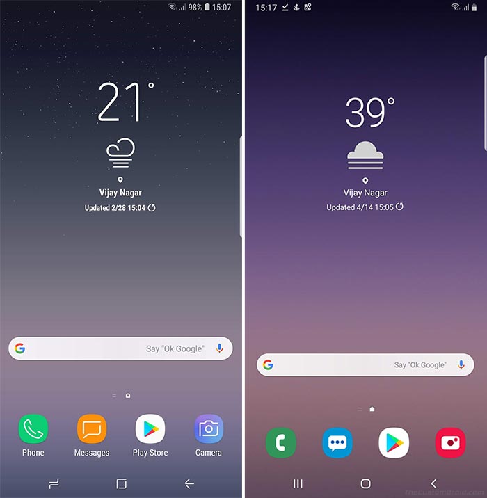
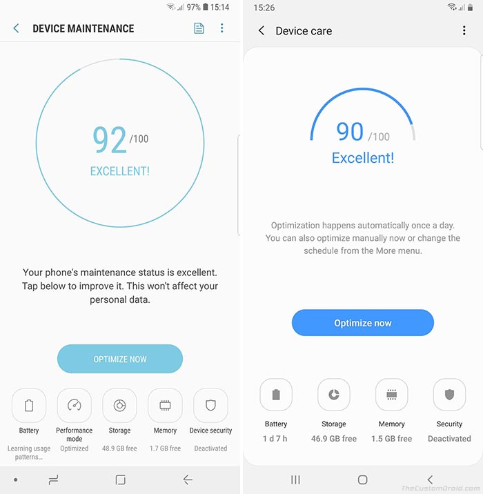
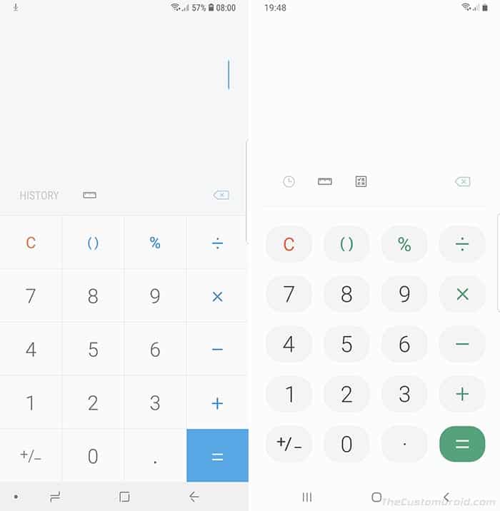
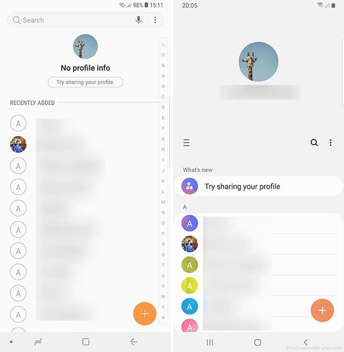
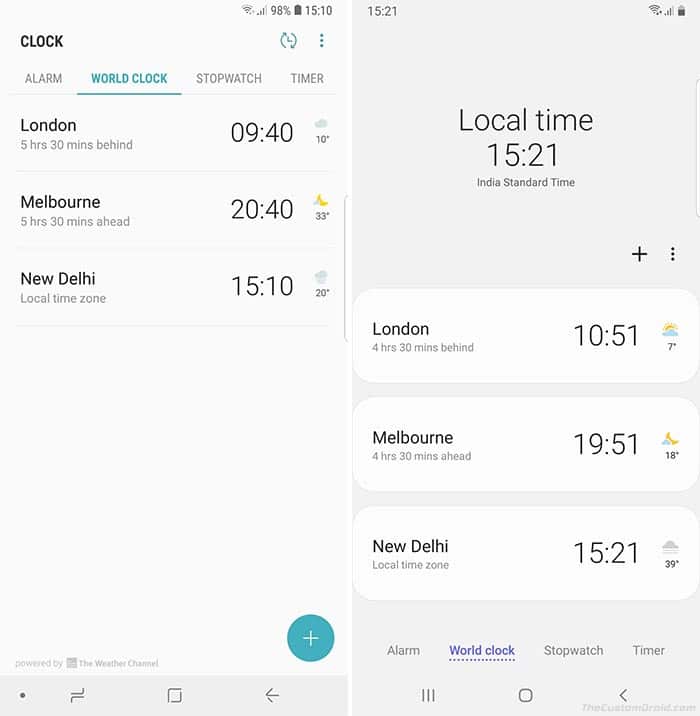
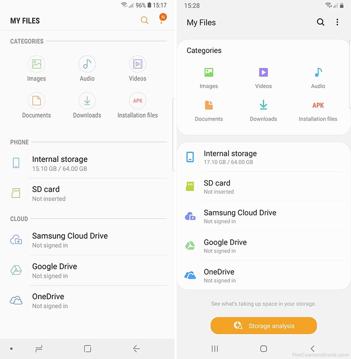
Unlike the flat lines and boxes in Samsung Experience, almost all elements of One UI’s design (Like Focus Blocks, notifications, settings, etc) now have rounded corners that look more intuitive and blend in seamlessly with the rounded displays of Samsung Galaxy phones. The same applies to all the stock Samsung apps as well, like Weather, Messages, Clock, etc.
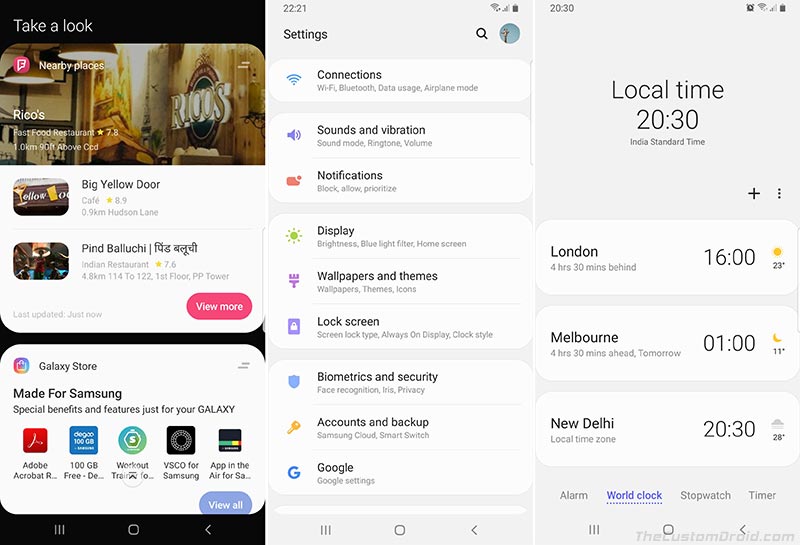
The next change in terms of appearance is the introduction of flat colors throughout the UI. It seems like Samsung is mixing in some Material Design hues to the interface, which definitely is one major reason why the new OS looks more refreshing and easy on the eyes. Doubt it? Just look at the neon eye-rattling colors of Samsung Experience.
Advertisement
Although not huge, these minute changes surely bring more focus to the tasks at hand by clearing the excess clutter.
3. Highly Improved One-Handed Usage
Since the modern day smartphone displays are getting longer every year, it’s often hard to operate your phone with one hand. Samsung already had the ‘One-Handed Mode’ feature that would move the whole screen to either end for easier operation. We have already seen several OEMs implementing the same like Huawei, along with a few dedicated third-party apps.
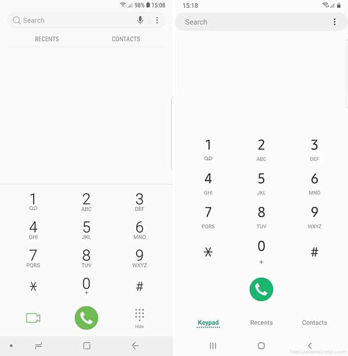
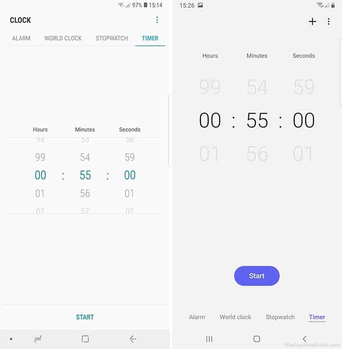
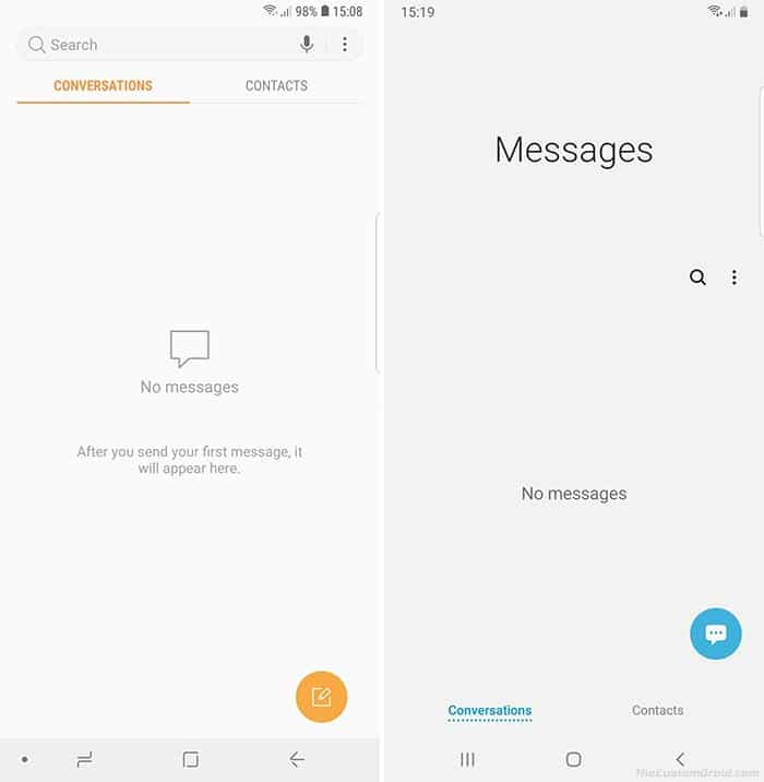
But with One UI, Samsung is taking another step towards improved One Handed usage. After analyzing how users operate their phones, Samsung decided to make a rather strong and unique move. The basic idea is to split the screen/window into two halves – the upper half for viewing the relevant information (Information Area), like the app name, and the lower half for interaction (Interaction Area).
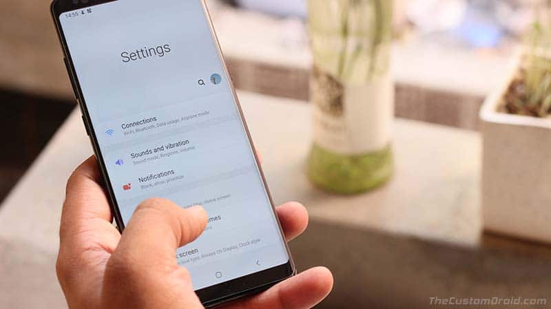
This change could be observed everywhere within the UI including Settings, Quick Settings panel, and also in the stock Samsung apps like Clock, Notes, Messages, Contacts, etc.
Users might have a mixed opinion on this since pushing down the actual content would create a lot of blank space and require more scrolling. While this is true, there’s no denying that the technique really works and I sort of, have started liking it. So, you wouldn’t really need to shrink down the whole window anymore (Like using One-Handed Mode feature) to be able to freely use your phone with one hand.
4. System-wide Night (Dark) Mode
This is probably the second most anticipated One UI feature after One-Handed usage. Dark Mode has developed to be a trend, partly for the reason that it saves battery on the modern AMOLED displays. But majorly because more and more users are now tilted towards darker shades throughout the interface (Not me, to be honest).
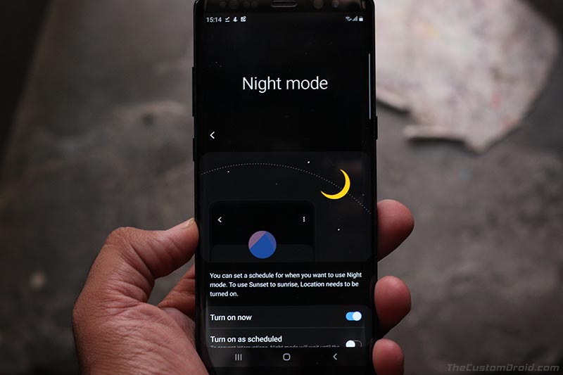
Dark Mode in Samsung One UI is known as ‘Night Mode’, considering it was merged to improve the viewability experience at night or in dark environments. Unlike Google’s dynamic approach, Night Mode can only be toggled using a switch or scheduled within the settings. To turn ON One UI’s Night Mode feature, go to the Settings > Display > Night Mode and switch the toggle.
Once Night Mode is turned on, the complete interface turns to dark black color including the Quick Settings, Notifications, Settings menu, etc. And most of the system apps also shift to this dark UI. Not only does this new feature turn the entire interface to the darker shade, but also automatically adjusts the screen tone, contrast, and brightness of the phone for an optimal and easy-to-the-eyes viewing experience.
Below are screenshots of a few different sections of the OS, where Night Mode has turned all the UI elements to dark colors.
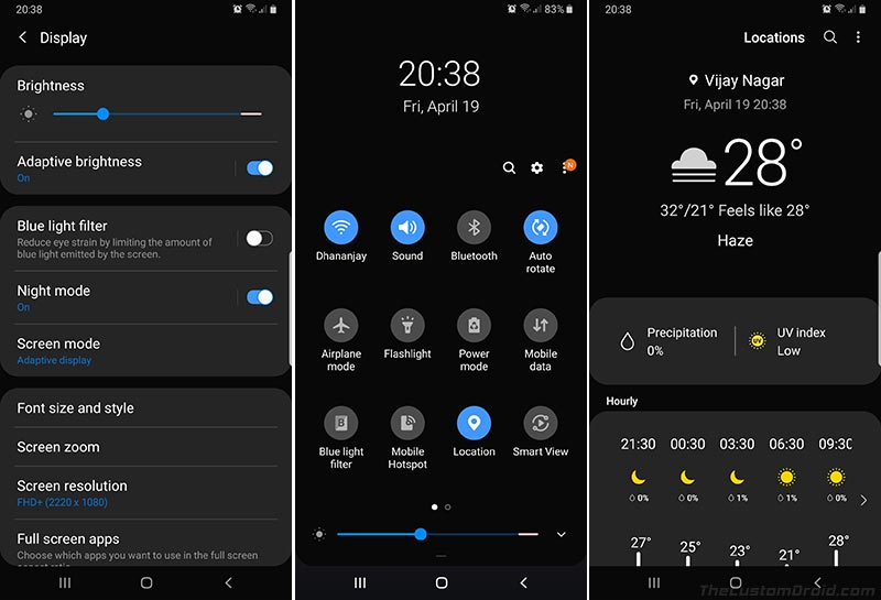
For those of you who are a fan of the dark themes, you wouldn’t need to install any Samsung themes separately, since it could now easily be done by turning on Night Mode on your Galaxy device running One UI.
Advertisement
5. Home screen, Lock screen, and Icons
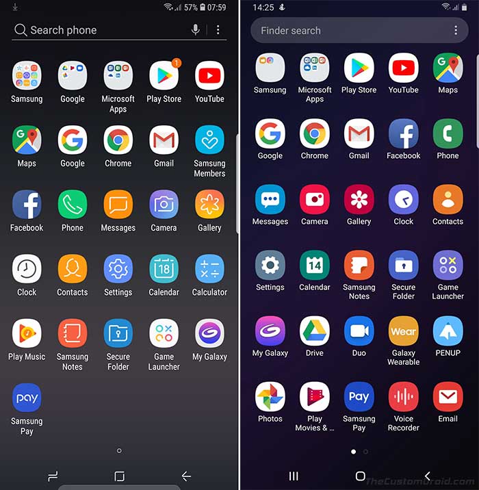
The launcher hasn’t seen much change coming from Samsung Experience. The dock icon layout and app drawer look, all operate in the same manner. It still seems like the one on Samsung Experience, but just running on Android Pie.
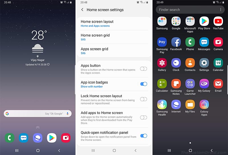
The only thing that freshens up the homescreen/launcher is the new flat colored icons. With One UI, Samsung has finally ditched the old gradient style colored icons and adopted the more Material-style icons, which surely brings consistency within the user interface.
Just like the Launcher Home screen, the Lock screen interface also seems to be stuck with the same design as on Android Oreo-based Samsung Experience. However, there are a few tidbit changes here and there. Following the overall UI aesthetics, the notifications on the lock screen now have rounded corners. Also, the clock on the lock screen now has adjustable face styles.
6. Notifications, Quick Settings Panel, and Settings
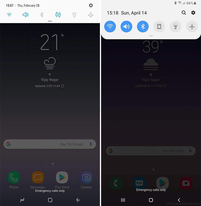
The notification panel follows the same aesthetics as the overall UI and has rounded corners. The only little addition to the area is the new finder search icon on the top right, besides the gear icon.
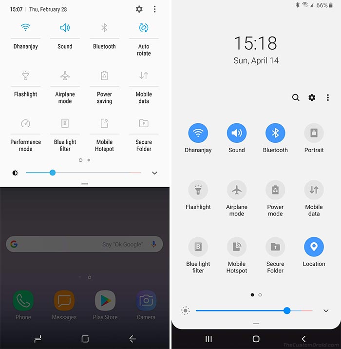
Moving on, the Quick Settings panel in One UI now expands to the bottom of the screen, again, pushing the toggles towards the lower half of the screen for easier one-handed access. The top of the QS panel is the viewing area, showing the current time, day and date. The default toggle layout is still 3×4 and could be adjusted to 3×3 and 3×5 grids.
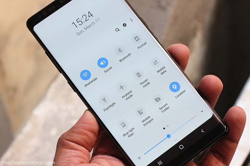
Unlike Google’s implementation in stock Android, quick settings toggles in One UI are further actionable and can easily be used to adjust settings, without having the need to dive into the device settings.
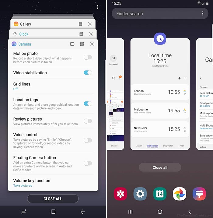
With One UI, Samsung neatly adapted the new Multi-tasking window (App Switcher) design from Android Pie. Instead of the vertically stacked cards in Android Oreo, the new design brings bigger app windows as a horizontal carousel. It also shows the most recently used apps on the bottom, with the Finder Search bar on the top.
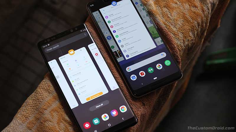
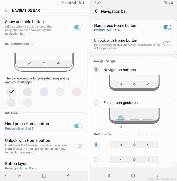
Aiding to the improved One-Handed usage are the newly introduced full-screen navigation gestures. And this is where I think Samsung has truly won. Samsung hasn’t chosen to fully impose gesture-based navigation on its users. Rather, it offers to choose between navigation buttons and full-screen gestures depending on your usage, creating a perfect balance between Android Oreo and Pie.
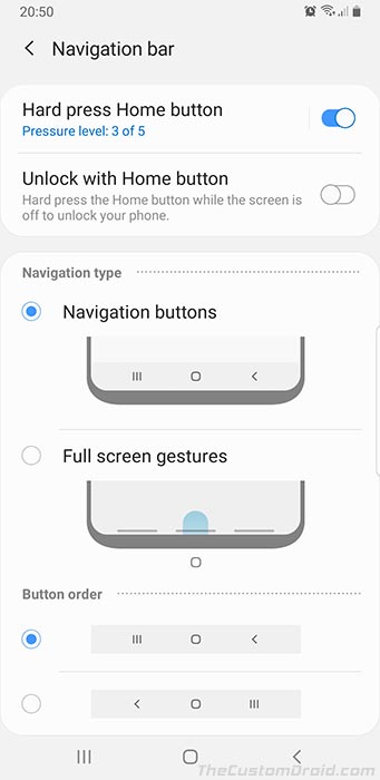
So if you want, you can either stick to the on-screen navigation buttons, with the ability to swap the back and recents button. Or, you can choose the full-screen navigation gestures, that will save some screen space too.
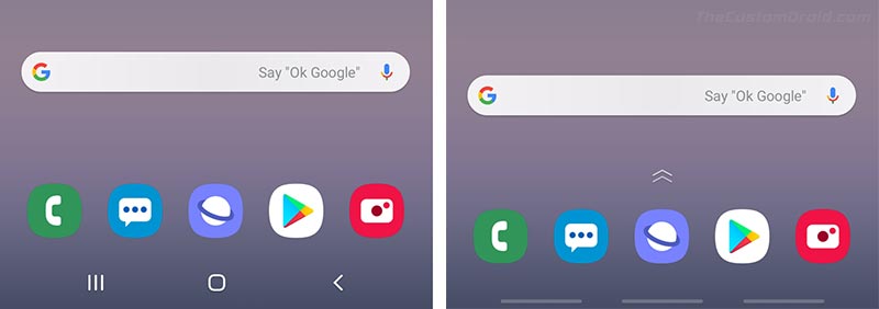
Unlike Google’s implementation, Gesture Navigation in One UI doesn’t include varying degrees of screen swipes, that might be confusing at first and somewhat different to adapt to (Yeah, I felt that ways when moving to the Pixel 3). Rather, it offers simple swipe-up gestures replicating the actions of the buttons that you’re already well acquired with.
Advertisement
8. Always-On Display
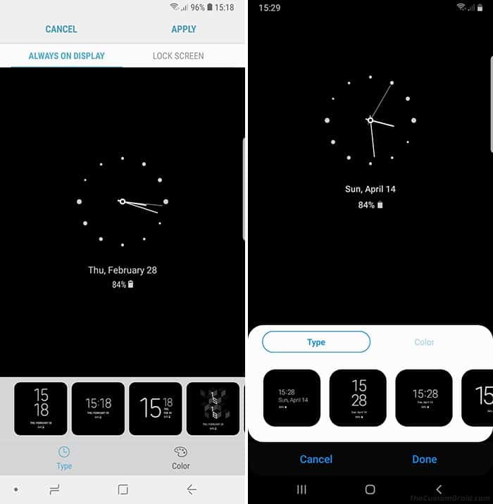
Always-On Display in One UI has received some improvements as well. There’s very little change to AOD in One UI on the visual front. So, it does look the same as on Samsung Experience.
All the new additions and improvements to Always-On Display are functional. To begin with, there’s a new option to view music information. Once enabled, you will be able to see the song and artist name on the Always-On Display without having to wake up the screen.
Although AOD isn’t a feature that’s too harsh on the battery, there’s no denying that it consumes a fair share of it. So Samsung implemented a new ‘Display Mode‘ setting that will allow you to adjust when the AOD is active. Following are three different display modes available in Always-On Display on One UI:
- Tap to Show: By default, AOD will be turned off and can be easily activated by tapping the screen. It will then be active for 30 seconds before it goes off again.
- Show Always: AOD will always be active when the screen is turned off.
- Show as Scheduled: You can use this option to enable AOD on a set schedule.
To adjust Display Mode settings for Always On Display on One UI, go to the Settings > Lock screen > Always On Display > Display Mode. In there, you will be to choose between the pre-stated options.
9. Improved Keyboard
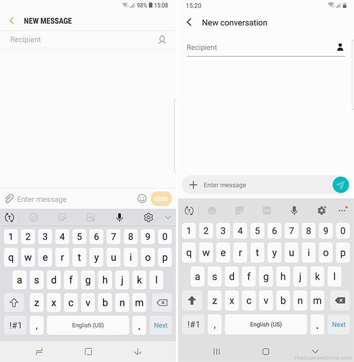
The stock Samsung Keyboard app is another section where the company worked on improving its usability. There are only a few changes here. First off, the keyboard now supports a dedicated Floating Mode like what you might have seen on Gboard. This surely improves usage when operating the phone with only one hand.
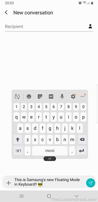
Another small new addition to the Samsung Keyboard is the new adaptive theme that changes based on the colors of the app you’re using. It surely blends in, right?
Well, that’s all for all the major Samsung One UI features that you can enjoy on your Galaxy device once it has been updated to Pie. If you think we have missed something, don’t forget to let us know what it is, via the comments.
Samsung One UI vs Samsung Experience
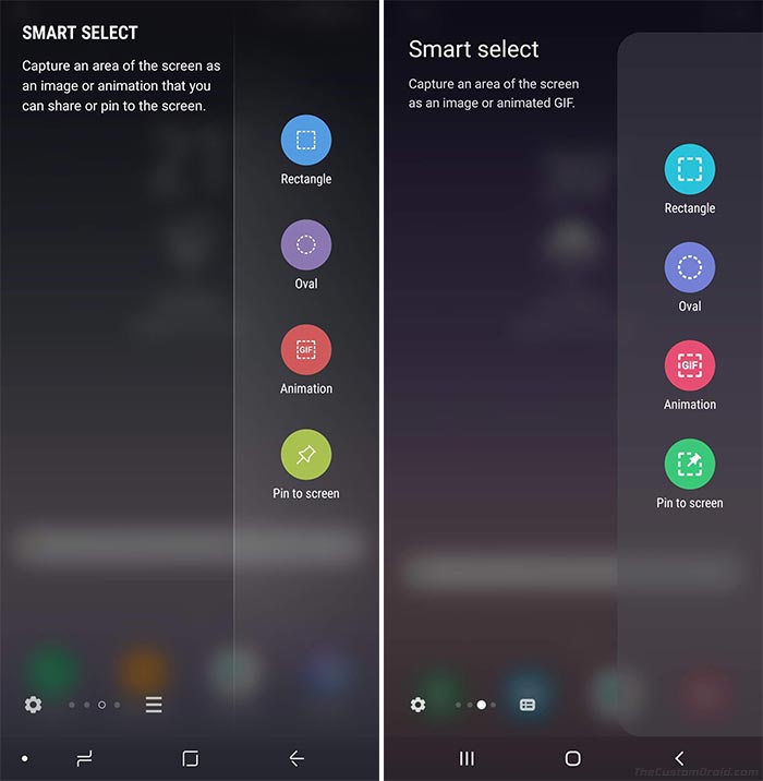
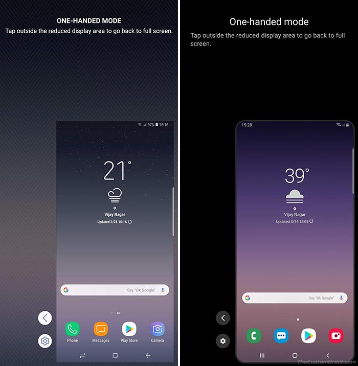
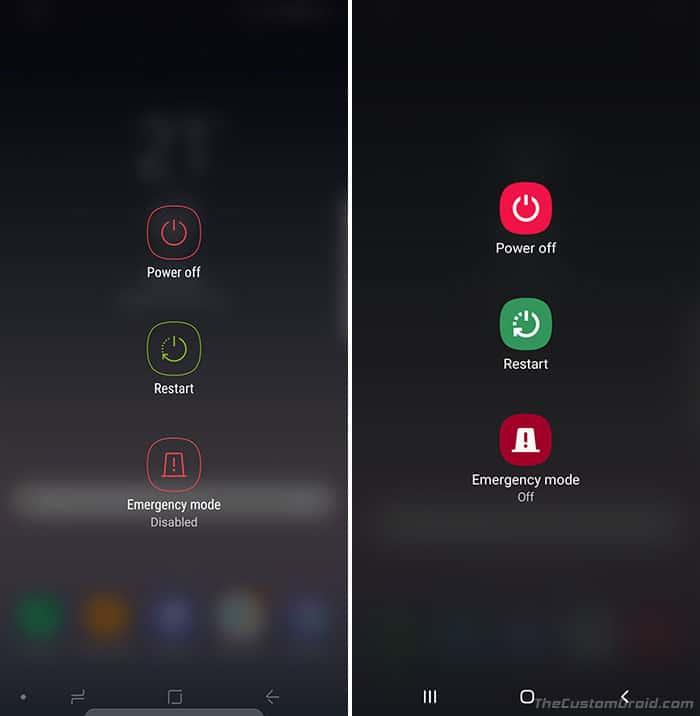
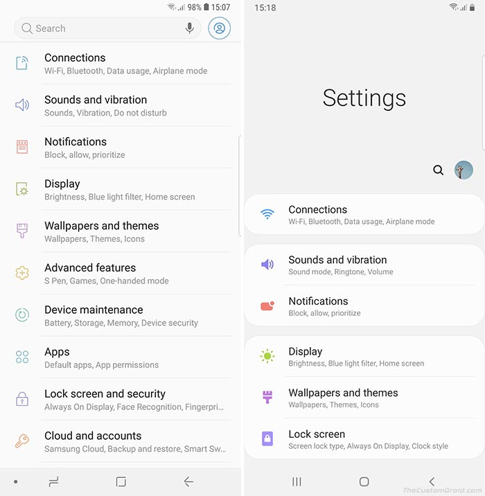
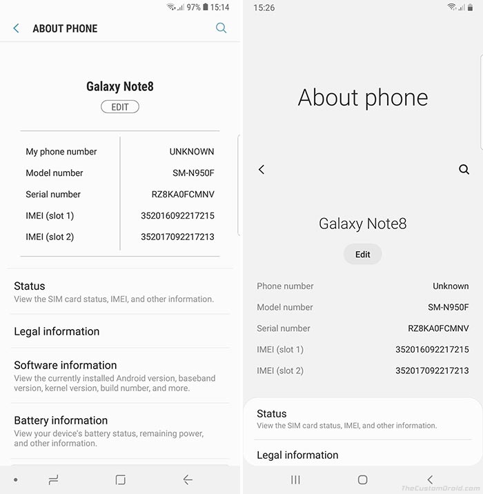
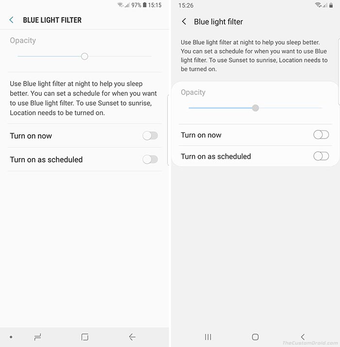
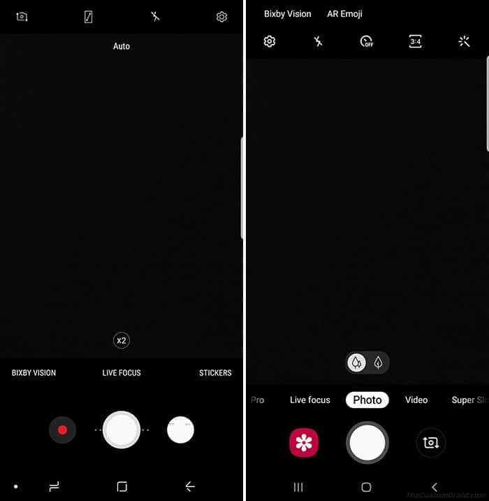
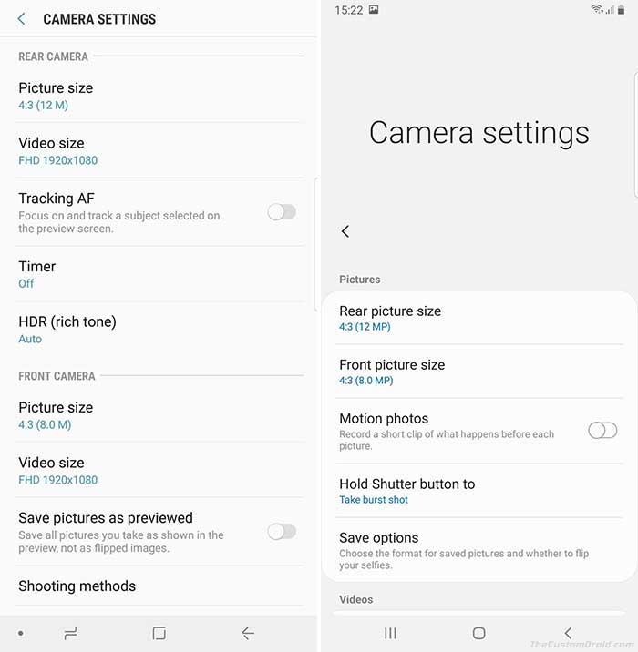
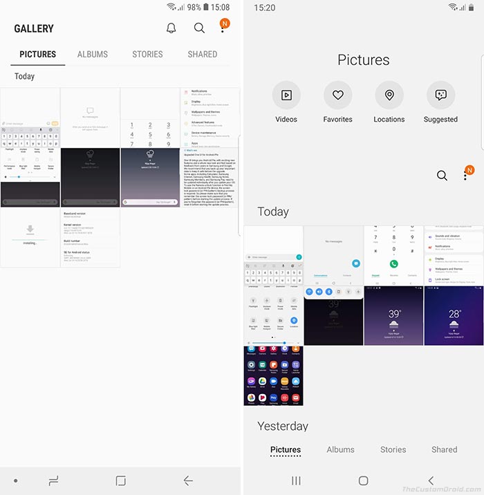
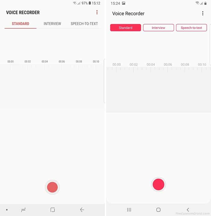
Below is a complete visual comparison between Samsung One UI and Samsung Experience in the form of screenshots. It shall help you get a straight idea of what has and has not changed from Android Oreo to Pie.
The screenshots on the left are of Samsung Experience 10 based on Android Oreo and on the right are those of Samsung One UI based on Android Pie.
Opinions
So that was all with the Samsung One UI review and here’s my personal verdict:
Although it still feels stuck in the past, Samsung One UI surely feels much fresh, clean, and fast when compared to Samsung Experience.
Yes, Samsung has come a long way, moving from the cluttered and laggy Samsung Experience. It was the only thing that stopped me from every buying a Samsung Galaxy smartphone. There’s no doubt that One UI feels much fresh, clean, and fast when compared to SE.
One UI hasn’t completely moved away from its predecessor and there are still parts of the OS that seem to be stuck in the past. But, considering the number of significant improvements that One UI offers, those things really don’t matter that much. And this is only the first version (v1.0) of Samsung’s latest software suite, who knows what more changes and improvements it would bring in the future.
Before you see off, don’t forget to let us know your views on the new One UI software. Do you like it? Is it a huge improvement over Samsung Experience? Do you think Samsung could have done much better? Are there any parts/sections of the OS that you hoped would have improved and still haven’t?
Do share with us via the comments. We’d love to put up your opinions in this section.
