Gmail for Android v9.1 brings new Material UI Theme (APK)
Gmail for Android has now been updated with the new Material UI theme (Unofficially referred to as ‘Material Design 2.0), new features, and a major overhaul of the app’s interface. You can […]
Gmail for Android has now been updated with the new Material UI theme (Unofficially referred to as ‘Material Design 2.0), new features, and a major overhaul of the app’s interface. You can now download Gmail for Android v9.1 APK and install it on your device.
Advertisement
Google first announced its new Material UI Theme for Gmail during Cloud Next 2018, back in July. The desktop web version of Gmail already got a huge upgrade last year, not only was the interface completely renovated, but it also started incorporating several new features powered by Machine Learning. There’s no doubt that it left a huge impact on the users, and made Gmail more functional than most other popular email services out there.
On 29 Jan 2019, Google started pushing a new update for its Gmail mobile app that not only included the new Google Material UI theme but also new features to make the overall experience better. And now, the wider rollout has begun.
Most of its native apps including Android Messages, Contacts, Photos, Phone etc have gradually adopted the new Material Theme style in form of app updates. With the new Gmail for Android v9.1.13 update, you can now enjoy the all-new Material UI look on your Android device and also the new features, as discussed below.
Advertisement
Gmail for Android v9.1 – What’s New?
The new Gmail for Android Material Theme looks highly identical and almost a cross-over of the web counterpart. Before you download Gmail for Android v9.1, let us take some time and see what’s new and changed in this update. Below we have tried and explain all the new features and complete UI overhaul whilst comparing it with the previous UI, along with corresponding screenshots.
The first most notable change in the UI is the new Product Sans font, already being used system-wide on the latest Android versions. Next, all icons in the app are now Material Theme wired-style and look more blended with the overall interface of the OS. Highlighting elements throughout the app now come with a Material color rounded-rectangle. Also the placeholder images in ‘Trash’, ‘Spam’ and other alike labels are now materialized.
Advertisement
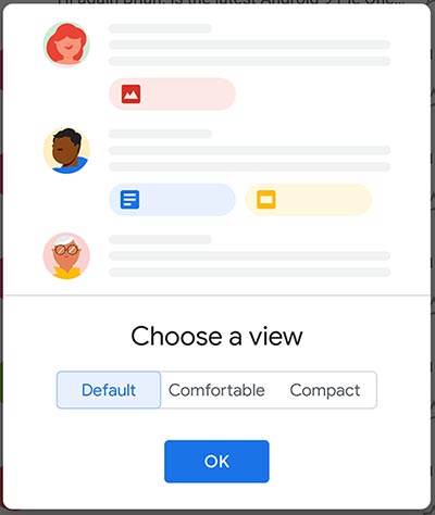
As soon as the updated app is launched, you’d be welcomed to the new UI and prompted to choose between three different density modes. It’s similar to what you might have seen on the web interface of Gmail.
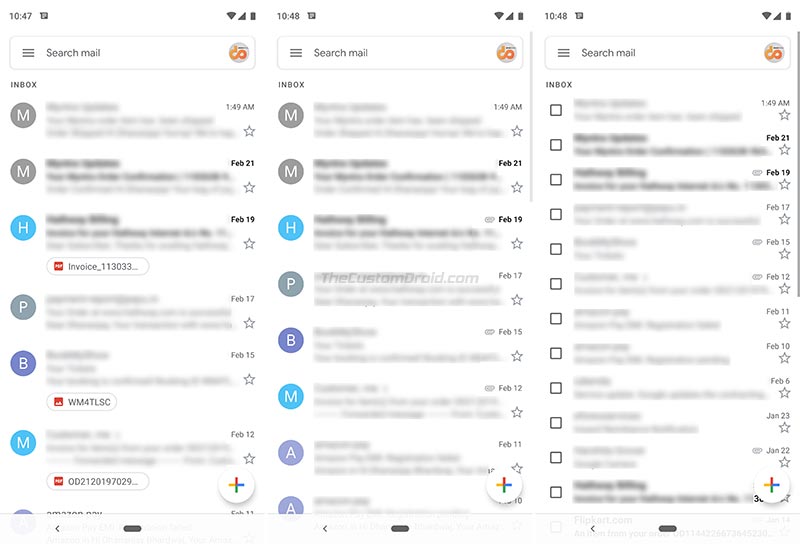
- Default: The Default mode is what will actually flaunt the new Google Material UI. It shows the attachments (If available) on the bottom of each email in a pill-shaped box, with a file-type icon and filename. It’s quite convenient as you can easily tap on the attachments to open them directly without having to open the mail and scrolling down.
- Comfortable: The Comfortable view is almost identical to the ‘Default’ mode in terms of density. However, it misses the attachment icons and shows a paperclip if a specific email has attachments.
- Compact: This is the most trimmed down mode and best for smaller screen devices. It removes the profile images from the left and replaces them with checkboxes for easier bulk selection.
You can even switch between density modes after the initial selection. To do so, simply go to app’s Settings > General settings > Conversation list density.
Over to the app’s main screen, the Red bar is now gone and replaced with a White search bar. On the new search bar, there’s a hamburger menu icon on the left and the Google account profile image on the right.
Advertisement
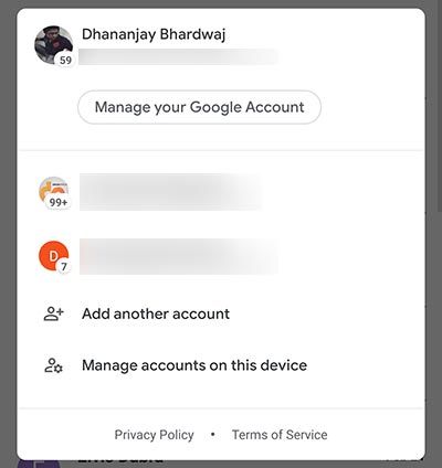
Tapping on the profile image triggers an overlay window, where you can switch between, manage, and add accounts. The unread message count is also displayed beside the corresponding account’s profile image.
Next up, the Floating Action Button (FAB) located on the bottom-right of the app’s window, used to compose emails has been revamped as well. The old Red color has been replaced with White, and the “+” icon is now multi-colored just like the Google logo.
Advertisement
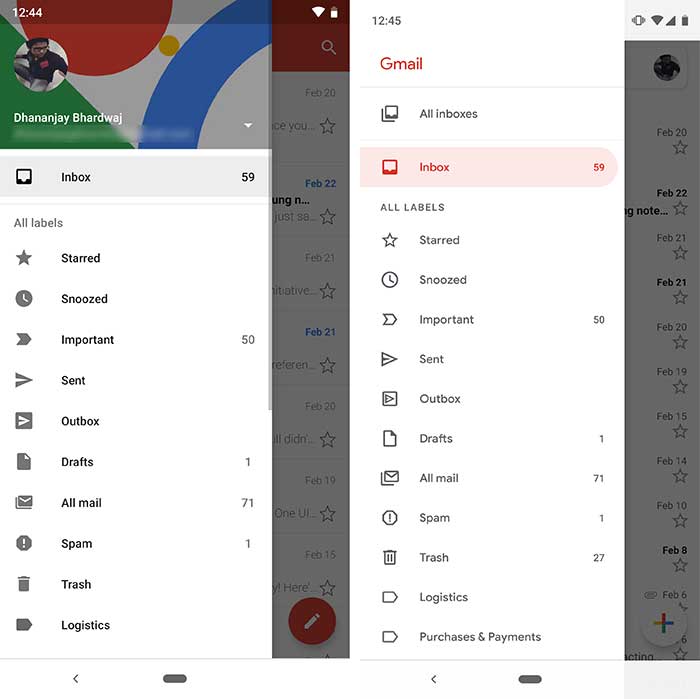
On the navigation drawer, a lot of space has been cut down with the account switcher gone and replaced with ‘Gmail’ on top. Below the ‘All inboxes’ and main ‘Inbox’ labels, there’s a new ‘Recent Labels’ section that holds the recently-accessed labels.
Overall, the app has seen a lot of little and some major changes including the new Conversation List Density Modes. Gmail for Android app now definitely blends in with the OS and the rest of Google apps which have already been updated with Google’s Material Theme design.
Download Gmail for Android v9.1 APK
Google has already started pushing the new Gmail for Android v9.1.13 update to the users via Google Play Store. To force check for the update, simply open the Play Store, tap on the menu icon and select “My apps & games”. Then simply press the refresh icon to check for the update. If for any reasons, you’re not able to update from the Play Store, or you’d like to update manually, then you can simply download the APK from the link below and install it manually.
- Before you sideload/install the app manually, you must enable ‘Unknown sources’ or ‘Install unknown apps’ in your device settings.
- For Nougat or below, go to Settings -> Security.
- For Oreo and Pie, go to Settings -> Apps & notifications -> Special apps access.
- Once enabled, download Google for Android v9.1 APK from APKMirror.
- If you’ve downloaded it to the PC, make sure to transfer the APK to the phone’s storage.
- Next, go to the app drawer and open the file manager app of your choice.
- Navigate to the location where the APK file is present.
- Tap on the APK and then on ‘Install’.
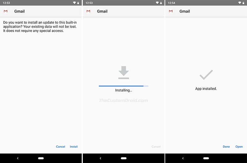
- When the installation is complete, press ‘Done’.
Once you have been able to install Google for Android v9.1 on your phone, you can launch it to experience the all-new and possibly better Material Design. There’s no doubt how significant difference a few little visual tweaks can make. The updated Google Material Theme has definitely bought some very nice changes to the app.
What’s your opinion about it? Do you like the new Material Design to be better than the previous one? Let us know in the comments below.
Source: Google | Via: 9to5Google
